


 Get the Book Here
At 81, Bret de Thier has no intention of slowing down.
The Christchurch born graphic designer, photographer, house designer and former Olympic Games competitor has enjoyed a long and eclectic career that has spanned everything from poster design to yacht interiors, to photography books, to furniture and architecture.
He studied fine arts and graphic design at the University of Canterbury’s School of Fine Arts from 1964 to 1968, then freelanced as a designer, taught at Auckland’s Elam School of Fine Arts, and later established himself in architectural projects. His design work includes notable contributions to publications, photo books on New Zealand and Australian travel, and a wide range of racing yacht interiors.
He’s just released a new book, which is a retrospective of his career, called ”Photography, Graphic Design, Yachts and Architecture.’ He spoke to us about where he gets his creativity from and some of the highlights of his very varied career so far.
How did this eclectic career of yours begin?
It’s interesting because when I was at art school – I actually failed the design component. I had to go back and catch up and during that process, I became really interested in design, in all its elements. My father was actually a builder, he was totally untrained, and I remember he would have his plans on the kitchen table, so that was an influence too. So I began with graphic design but designed my own house in 1970.
And you weren’t trained as an architect?
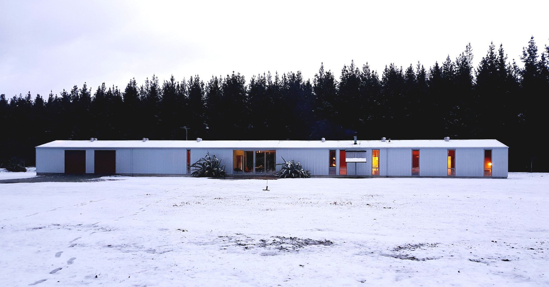
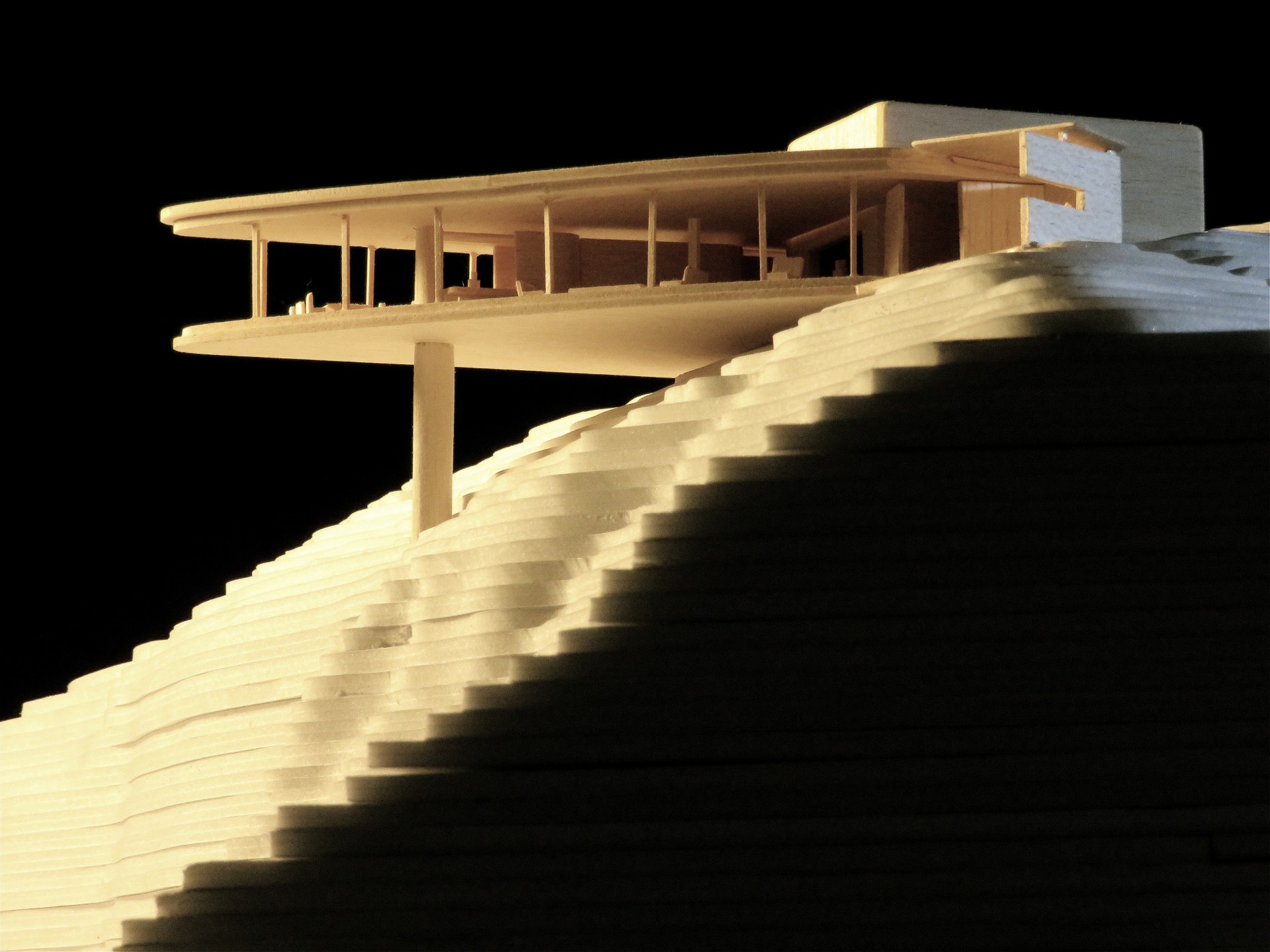
No. I had no architectural or technical drafting training. I thought that you needed to be a maths whiz to do architecture, but when I designed that first house, I realised that that wasn’t the case. After that I designed another couple of houses for myself in Kaipara so really just sort of stumbled into it. I subsequently designed another five houses for clients in Northland, and later another two houses in Canterbury.
And of course – you also designed yacht interiors.
With yachting, I used to do small yacht racing and in the 1980s I became involved in ocean racing as a crew member on ‘Swuzzlebubble’ in 1982 and I designed her interior. That led to designing, in collaboration with Bruce Woods, the interior and hull graphics for Peter Blake’s ‘Lion New Zealand.’
Your career has certainly taken lots of turns!
I think that’s what I did, I really just grabbed opportunities as they came along. I wasn’t fixed on just one thing. A lot of what I did in my career was pre-computer – and in the process of putting this book together – I was having to drag out hard copies of all things I’ve done, and you do realise how many different areas you move into. At the time I was doing these things, I wasn’t conscious of changing things – I’d just have graphic design on the drawing board and then jump into something else like house design. The designer’s thought process of analysis, problem solving and finding a workable, and hopefully elegant, solution can transfer across disciplines.
You mentioned your dad drawing plans on the kitchen table – did he study architecture?
No, not at all. He came back badly injured from the war, and he became a self-taught builder. I would watch him drawing at night and I learnt from that. These days it’s a very different process, but back then it was a lot easier to build your own houses. When I designed my first house in Sumner, I did two pages of drawing and three pages of specs and had it signed off. It’s still standing, even after all the earthquakes.
So you went to art school in 1964 – was that unusual in those days to choose a discipline in arts?
Not really. Ilam had a very good reputation; it had some really good tutors like Bill Sutton and Maurice Askew. Because I was always able to draw, my mum steered me towards art school. It was a really dynamic environment to learn in.
And you had some fairly impressive classmates too?
One of my best mates there was Ken Griffiths who became one of the UK’s top photographers. There was Dick Frizzell was the year ahead of me, and in my year, we had Bill Hammond, Neil Dawson, Gavin Bishop, Mark Adams. Printmaker Barry Cleaven, who died recently, was also at Ilam at the time.
All of you so different!
It’s funny because we learnt as much, if not more, from each other. I was doing Graphic Design and with Ken doing photography, that meant we branched out into fashion. It was really a great environment. We were so lucky- it was all happening then.
Looking back specifically on your graphic design work – many examples of which are in your new book – are you able to look back from this distance and see how significant they were at the time?
Ten years ago, the University had an exhibition of my super enlarged early 1970s Christchurch Arts festival posters and when I went to see it, I thought they stood the test of time rather well. Putting this book together and pulling out lots of the old posters and designs, it was a bit of a buzz putting it all together. I look at it now and think, ‘that’s okay’.
It’s better than ok, Bret! How would you describe your overall style?
It’s very Swiss style typography, quite minimalist and stripped back. I was lucky when I left art school, I got a job at ‘Bascand Printers’, and two of the guys working there were Dutch designers – Jaap Koster and Kees Verberg – and they had been right through the Dutch school of typography and design, and so I learned a hell of lot from them.
Do you have a favourite font?
When you go into modern day computers, you have hundreds of typefaces to choose from – but you probably only ever need to use a limited number of typefaces in your career. I do like Gill, Futura and Frutiger – gone off Helvetica – for sans serifs. Garamond Old Style and Bodoni for serif faces. The unimprovable 2000-year-old Trajan occasionally where a graphic deserves its elegance.
As a designer, do you find you’re observing – and possibly judging – signage all the time? Can you walk around and not notice all the design?
I notice it all the time. I saw some signage at the lift in a shopping centre in Christchurch city recently and it was lovely. I took a photo of it and sent it through to my friend, who is also a graphic designer. That’s what we do – we send each other photos of type. It does upset me though when I read modern magazine typography. I’d say 80% of the type fonts are not very good.
Okay – here’s a tricky question: Should anyone ever use Papyrus font?
Well, all I’ll say is I’ve never used it and I never would.
You’re also a very fine photographer and you’ve self-published two books, ‘Highway One (NZ) and Highway One (Australia). How does your photography fit in with your career?
It’s part of design, I think. When you take a photo, you compose it as you do with design. I think my photography is another case of me stumbling into things, when I moved to Auckland in the 80s I would drive back to Christchurch and take shots of State Highway 1 along the way, then after a few years I realised I had some pretty good shots, but I needed to finish it off by going to Bluff and Cape Reinga – which I did. I had a lot of fun putting that together and that led me on to the Australian book which followed the same pattern, and I have to say that was the best thing I ever did. Photography is interesting though, because when you are shooting with film, it really focuses you. I never crop a shot, and I always use the full shot and I never touch the photos up. Mainly because I don’t know how to use Photoshop, but also because it’s a good discipline to have to ask yourself whether the shot you’re taking is going to be good enough for a book.
It’s interesting you say that about photoshop – given we are now in the age of AI – how concerned are you at the pervasive use now of generative AI?
It’s disturbing. I’m in my studio at the moment, and I’m looking at a Pink Floyd album cover – you know the one where there’s a beach with hospital beds and a couple of Alsatian dogs and some nurses. That image is stunning. It’s got a magic to it and part of that is because you know it’s real. Now, it’s getting hard to tell what’s real and what’s not. But I don’t think it’s necessarily going to replace human design – I have a friend who’s a very clever guy and engineer and inventor and he uses AI a lot. For comment he recently sent me a floor plan of his planned new house in Fiji. My response was it was “obviously generated by AI – hopeless layout.”
You have a very creative family – not only were your parents creative, but your children and grandchild also have the creative gene.
My father was very creative. And my mother was as well. She was a fashion model, and later went on to be a window dresser for Ballantynes. She also worked in theatre, so I did hours of set painting as a kid. Her parents were also very creative, and my father’s side was also very creative. My daughter (Fleur de Thier) is a choreographer and dancer.
And your grandson Jesse, is also a photographer?
He went to Ilam and like me, he’s mad on film photography. He has my old Nikon camera and he’s doing some great things with it.
Do you ever feel not creative?
Not really, there’s always something. At the moment I’ve been working on a new flag design, it’s a proposal for a new national flag, something I’ve been working on since 1985.
Are you reigniting the flag debate, Bret?
The Union Jack – which is of course part of our current national flag – is probably the most stunning flag design in the world, as a piece of graphic design it works amazingly well, uniting three flags of three different countries. But our flag, doesn’t really work as a cohesive design, it puts two elements together, but it’s not united in the way that the Union Jack is. When the flag referendum was being held, I put a design into the competition – I think every graphic designer did because we all wanted change – but the panel, which didn’t have any designers on it, chose designs that weren’t great, so in the end I had to vote for the current one. I think there will be renewed interest in a new flag if Scotland eventually pulls out of the UK, the Union Jack will become obsolete, so we’ll be forced to change. However, we will need a much better process that includes designers.
I always quite liked the Hundertwasser flag.
I have a funny story about Hundertwasser. He famously built these buildings in Austria and Germany before moving to New Zealand, and he was giving a lecture at the School of Architecture in Auckland one day. His whole lecture was about the evil of the straight line. The Dean of the school asked me if I would give Hundertwasser a tour of the campus and so we headed off and at that time he was busy promoting his flag design and he had with him a stack of A4 flyers which he was pasting up on lampposts and walls. When we went into the art school, he pinned up his poster and we walked off but then he glanced back at the poster, and went and realigned it because the drawing pin wasn’t straight. He looked at me and smiled. He knew he’d been sprung!
This is probably a very difficult question to answer – but do you have a favourite project out of all the things you’ve done?
I got a real buzz with ‘Swuzzlebubble’s’ interior as it was groundbreaking at the time. It was so beautifully built, and was featured in German magazines. That was one of my favourites. The house I did on Radar Hill in the Far North – I got a real buzz of satisfaction when I did my last site visit. It’s a modest house but everything just clicked.
Do you have any advice for designers who are starting out?
I knew you were going to ask that. I’m really not sure. What I would say is – I’m a great friend of pencil and paper. Don’t do too much on the computer – things happen between your hand and your brain that don’t happen on the screen. The other thing I would say is do other stuff in life – don’t be too obsessed or fixed in what you’re doing. If you’re too rigid you miss opportunities.
What’s next for you?
I’m designing a house/studio, also way up North near Kaeo. Three weeks ago I designed the best poster I think I’ve ever done (it didn’t make the book), so at age 81, I guess the message is, ‘never stop!’ Apart from that, I’m flat out organising book launches.
Copies of the book are available by clicking here.